Brasil Paralelo
App Redesign
Year
Client
Services
2022
Brasil Paralelo
Product Design
1 – Project Context
1.1 – Background on Brasil Paralelo
Before we dive into the project, it’s important to provide some context about Brasil Paralelo and its streaming service. Brasil Paralelo is a Brazilian company that focuses on producing educational content and documentaries. Established in 2016, their aim is to provide an alternative perspective on a variety of subjects related to Brazil’s history, politics, economy, and culture. According to their website, Brasil Paralelo’s mission is to:
…rescue good values, ideas, and feelings in the hearts of all Brazilians.
Brasil Paralelo has experienced significant growth in recent years, despite the controversial political discussions generated primarily by their documentaries, which often adopt neoliberal perspectives. These documentaries are produced as series and cover topics such as Brazilian history and the formation of Brazilian political thought. They are distributed through the company’s streaming platform and are also available on DVD. Here are some recent figures from Brasil Paralelo that can be found on their website:
- +15 million unique viewers in 2022.
- +550,000 subscribing members.
- 16.8% growth rate.
- +90 courses in 10 categories.
- +140 original productions.
In addition to documentaries, Brasil Paralelo also offers educational content such as online courses, lectures, and interviews, covering a wide range of topics relevant to understanding Brazilian reality.
Recently, Brasil Paralelo expanded its streaming service to include movies and series, which sparked another period of growth. It is within this context of growth that we propose redesigning certain parts of their application.
1.2 – Why Redesign the Brasil Paralelo Streaming App?
But why did I choose the Brasil Paralelo app for a redesign? The main reason is the rapid growth of their streaming service, which has revealed a series of issues with their mobile application. Furthermore, I found it interesting to work with a genuinely Brazilian streaming app focused on educational content.
2 – User Research
2.1 – App Store Feedback Research
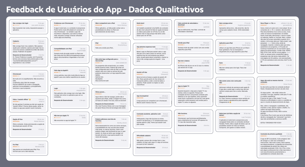
Before starting the development of solutions, I conducted an initial research phase to identify the issues users face while using the app. It is crucial to understand the users’ needs, frustrations, and problems encountered during app usage in order to guide the redesign of the screens.
To gather quick and relevant information about the problems users face, I utilized a valuable source of qualitative data that is often overlooked: the feedback left by users in the app store. These comments provide direct insights into the difficulties users encounter and allow me to have a comprehensive understanding of the usability issues found in the app.
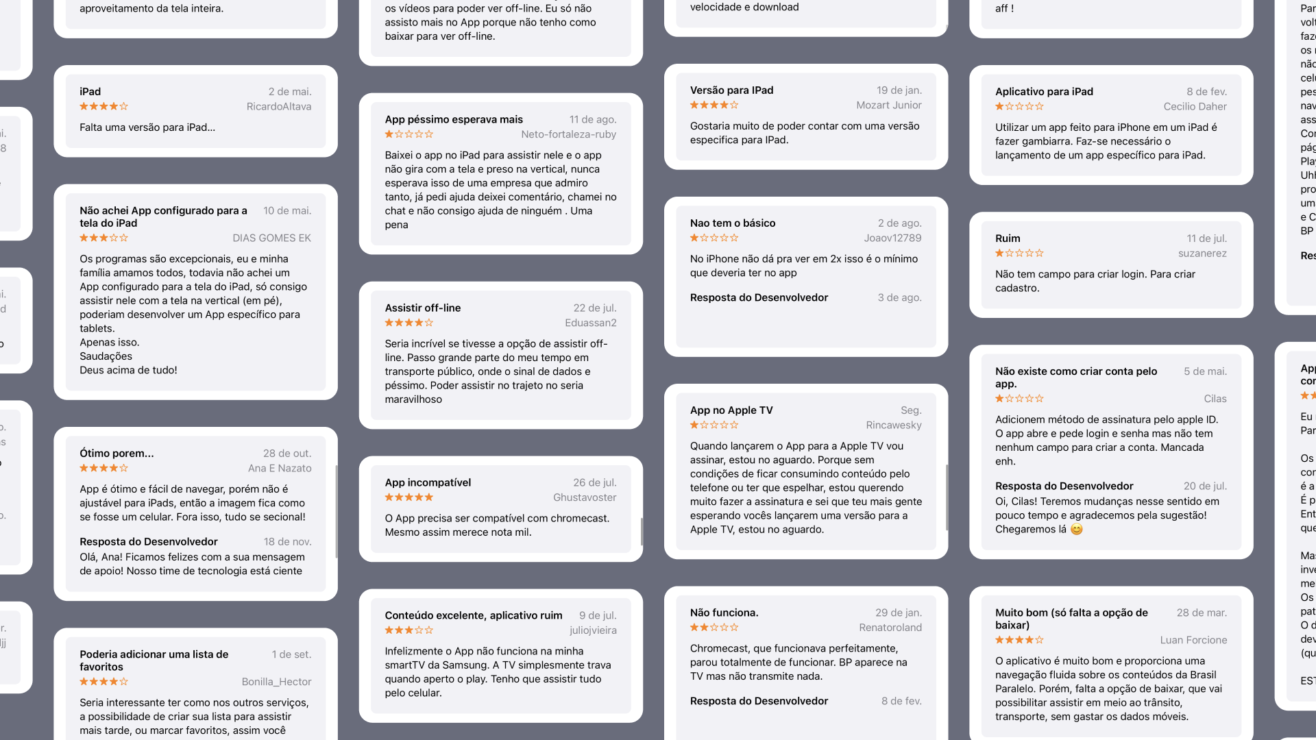
I collected a wide range of user feedback, addressing different aspects of the app experience. This diversity of opinions helped me gain a comprehensive understanding of the issues users were facing. With this data in hand, I proceeded to the analysis stage.
2.2 – Data Analysis, Insight Extraction, and Solution Brainstorming
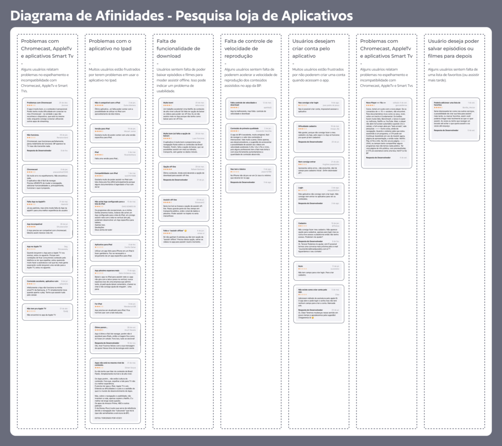
To visualize the most common problems identified in user feedback, I used a technique known as “Affinity Diagram.” I grouped similar feedback and organized these cards into categories, highlighting the most recurring issues. This diagram helped me identify the areas with the highest impact on the user experience.
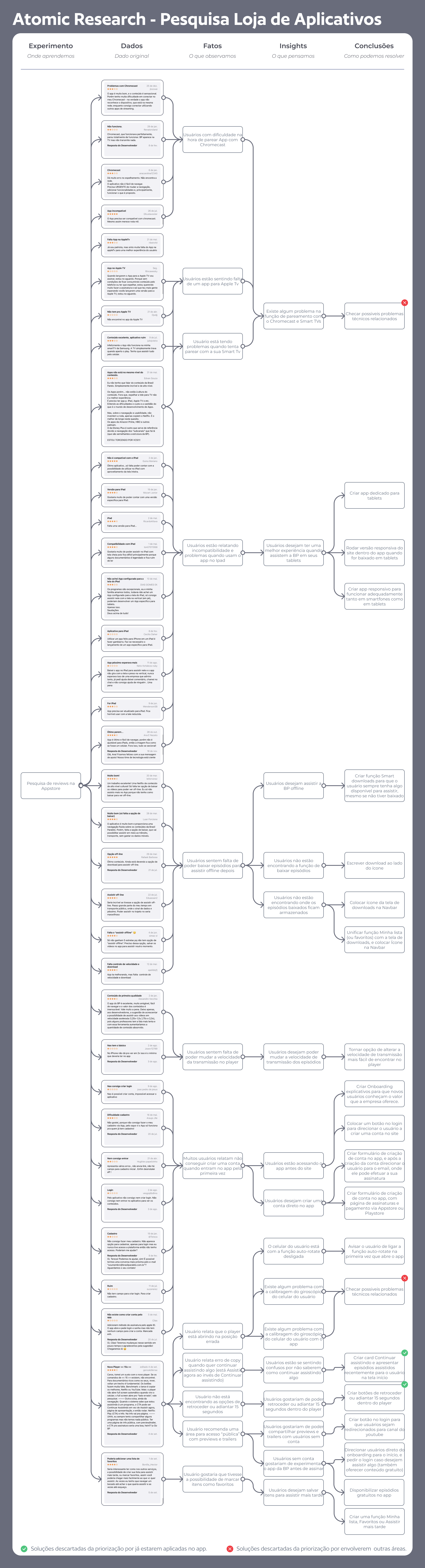
After the feedback grouping stage, I used the “Atomic Research Diagram” to extract relevant insights. We transformed the raw data collected into observable facts, clearly describing what was identified in the feedback. Based on these facts, I extrapolated insights that helped me understand the underlying reasons for the users’ issues.
The main insights related to the user experience obtained from the facts were:
- Users want to create an account directly within the app.
- Users are accessing the app before the website.
- Users want to save items to watch later.
- Users without an account would like to try the Brasil Paralelo app before subscribing.
- Users would like to be able to share previews and trailers with non-account users.
- Users want to watch Brasil Paralelo content offline.
- Users would like to be able to rewind or fast-forward 15 seconds within the player.
- Users are feeling confused about how to continue watching something.
- Users want to have a better experience when watching Brasil Paralelo on their tablets.
- Users want to be able to change the playback speed of episodes.
- Users are not finding where downloaded episodes are stored.
- Users are not finding the function to download episodes.
Based on the insights obtained from the research, I conducted a brainstorming session to generate ideas and proposed solutions. I explored different approaches to improve the user experience in the app, considering aspects such as ease of implementation (both in design and engineering), potential impact (cost-effectiveness of the solution), and alignment with business objectives.
2.3 – Solution Prioritization and Redesign Scope Definition
Desiring a quick redesign focused on specific improvements, I used an impact vs. effort matrix to prioritize the generated ideas. I identified solutions that could have a significant impact on the user experience while requiring relatively low effort from the design and engineering team.
Based on this process, I selected two main solutions to prioritize in the redesign:
- Creation of an Explorative Onboarding Flow: Develop an onboarding process that introduces new users to the value offered by the company. This would help users better understand the app’s features, improve the acquisition rate of new users, and enhance the activation rate of member users.
- Account Creation Form: Redesign the account creation form in the app, allowing new users to create an account without having to visit the website. This would improve the acquisition rate of new users within the app, especially those who would be having their first interaction with Brasil Paralelo through the app.
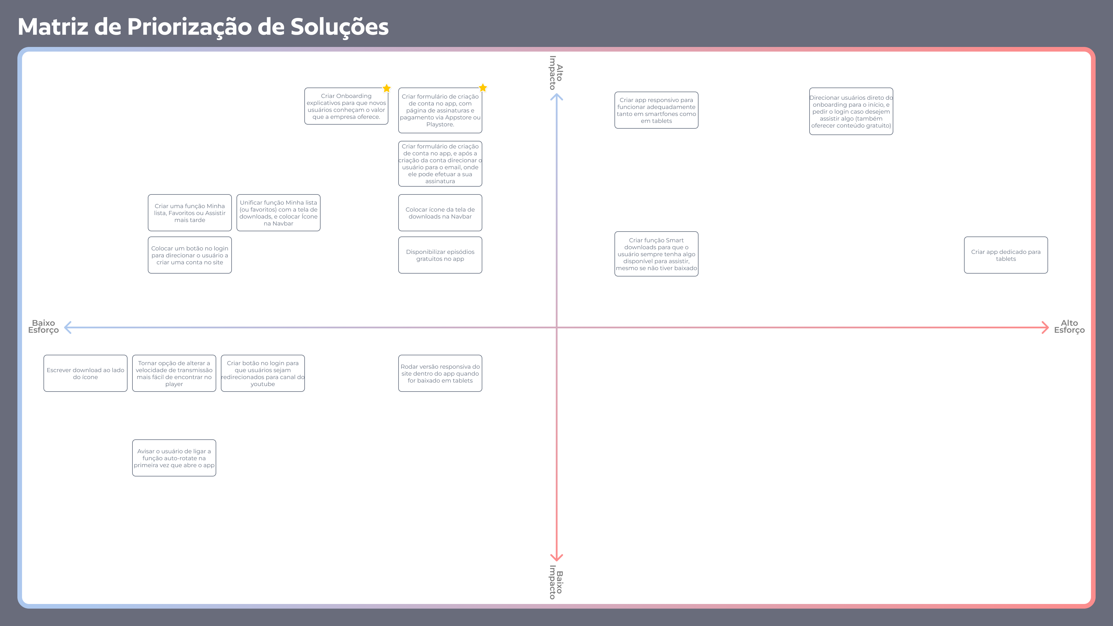
The two prioritized solutions have a broad scope and focus primarily on improving the acquisition and activation of the application. However, in addition to these solutions, other changes will also be made to promote a better overall app experience.
3 – Competitor App Analysis
3.1 – Why Conduct a Competitor App Analysis
Before starting the redesign of the application screens, it is essential to conduct an analysis of screens and flows from competitor apps. This analysis allows for the identification of best practices adopted in the market, understanding user expectations, identifying possible weaknesses to avoid, and exploring innovative solutions that can be studied.
In this stage, it is important to select relevant applications, considering both the most popular ones and those recognized for their innovative features. Additionally, it is crucial to keep in mind Jakob’s Law, which states that “users spend most of their time on other websites/apps, not yours.” Therefore, the designed screens should function similarly and have similar UI patterns to other applications that users are already accustomed to.
3.2 – Competitor Analysis Process
Firstly, I compiled a list of streaming applications that offer a similar value proposition to the Brasil Paralelo app. The following apps were included in this list: Amazon Prime Video, HBO Max, Paramount+, Netflix, and Disney+. Based on the scope of the redesign, I captured screenshots of all relevant screens from the competitor apps and imported them into Figma, my chosen design tool. These screens were organized to form the flow of each application. Additionally, I also included the user flow and screens from the current Brasil Paralelo app.
Using these screens and flows, I began the analysis. I thoroughly examined different interface elements present in each of the applications and their respective flows, aiming to understand best practices and identify opportunities for improvement. From this analysis, relevant insights were identified to guide the redesign of the Brasil Paralelo app. Below are some of the key insights obtained from each of the analyzed applications:
Amazon Prime Video
- New users may face difficulties creating an account within the application as there is no option available for it. Users must already have an account to log in.
- The application’s interface exhibits heuristic issues, which impact the user experience.

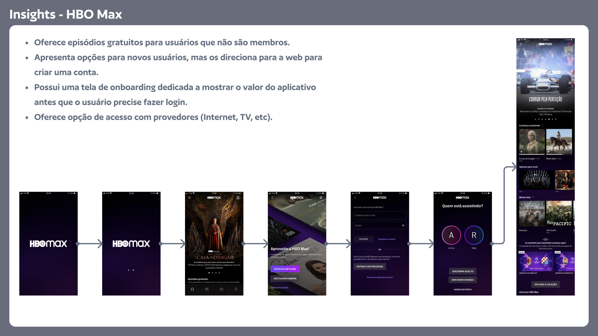
HBO Max
- Offers free episodes for non-members.
- Provides options for new users but directs them to the web to create an account.
- Has a dedicated onboarding screen to showcase the app’s value before the user needs to log in.
- Offers the option to access the app with service providers (Internet, TV, etc).
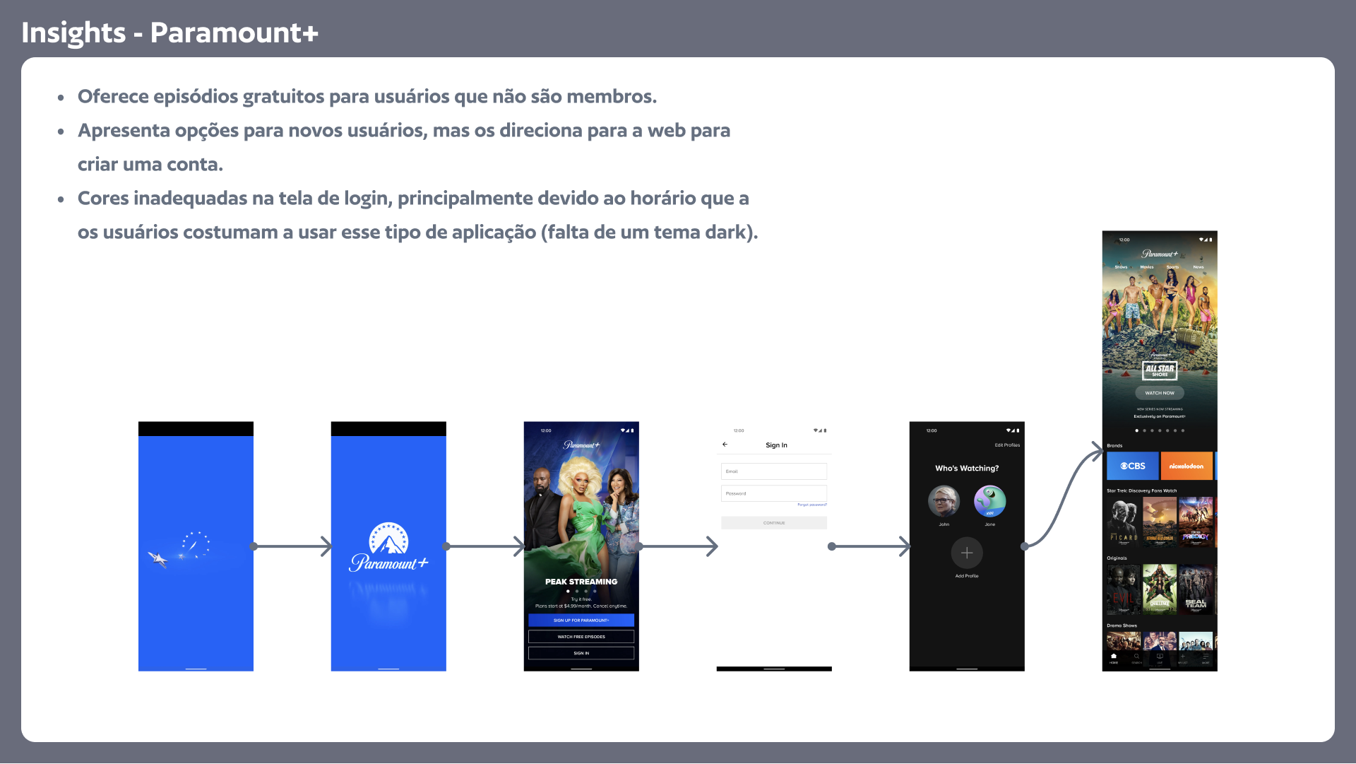
Paramount+
- Offers free episodes for non-members.
- Provides options for new users but directs them to the web to create an account.
- Inappropriate colors on the login screen, particularly considering when users typically use this type of application (lack of a dark theme).
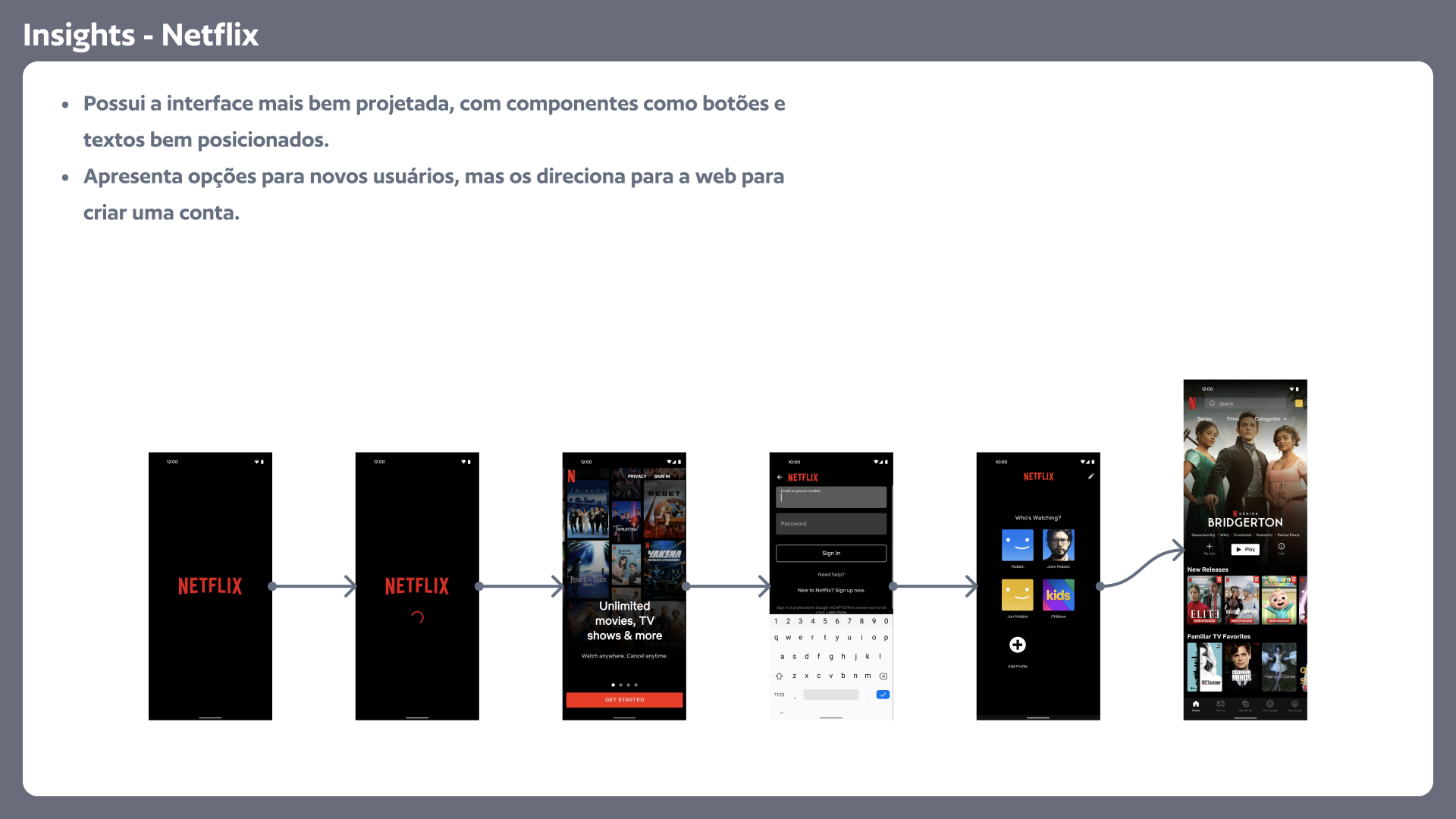
Netflix
- Has the most well-designed interface, with components such as buttons and text well-positioned.
- Provides options for new users but directs them to the web to create an account.
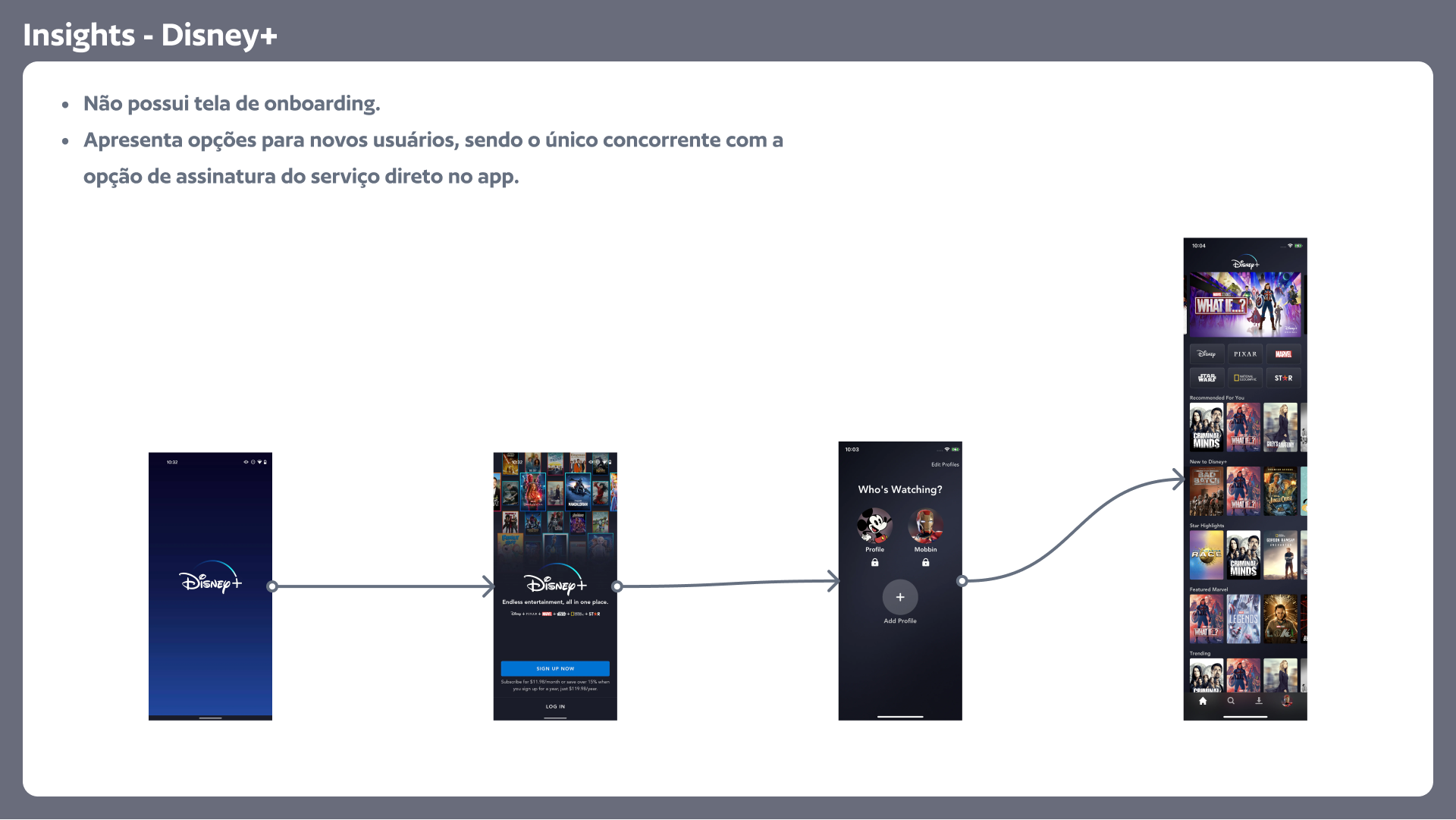
Disney+
- Does not have an onboarding screen.
- Provides options for new users and is the only competitor with the option to subscribe to the service directly within the app.
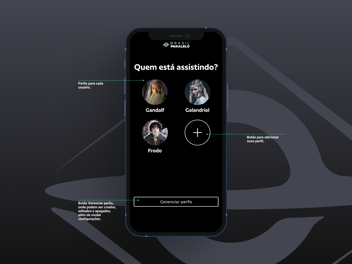
In addition to these insights, a crucial aspect observed in all competitor applications is the presence of user profile selection functionality. This feature allows different users to access the same account, which is common in streaming services as they are often shared among family members. The creation of individual profiles is essential for the proper functioning of movie and series recommendations, as well as ensuring that viewing history is personalized for each user, regardless of the account. The Brasil Paralelo app does not have this functionality and will need to be implemented.
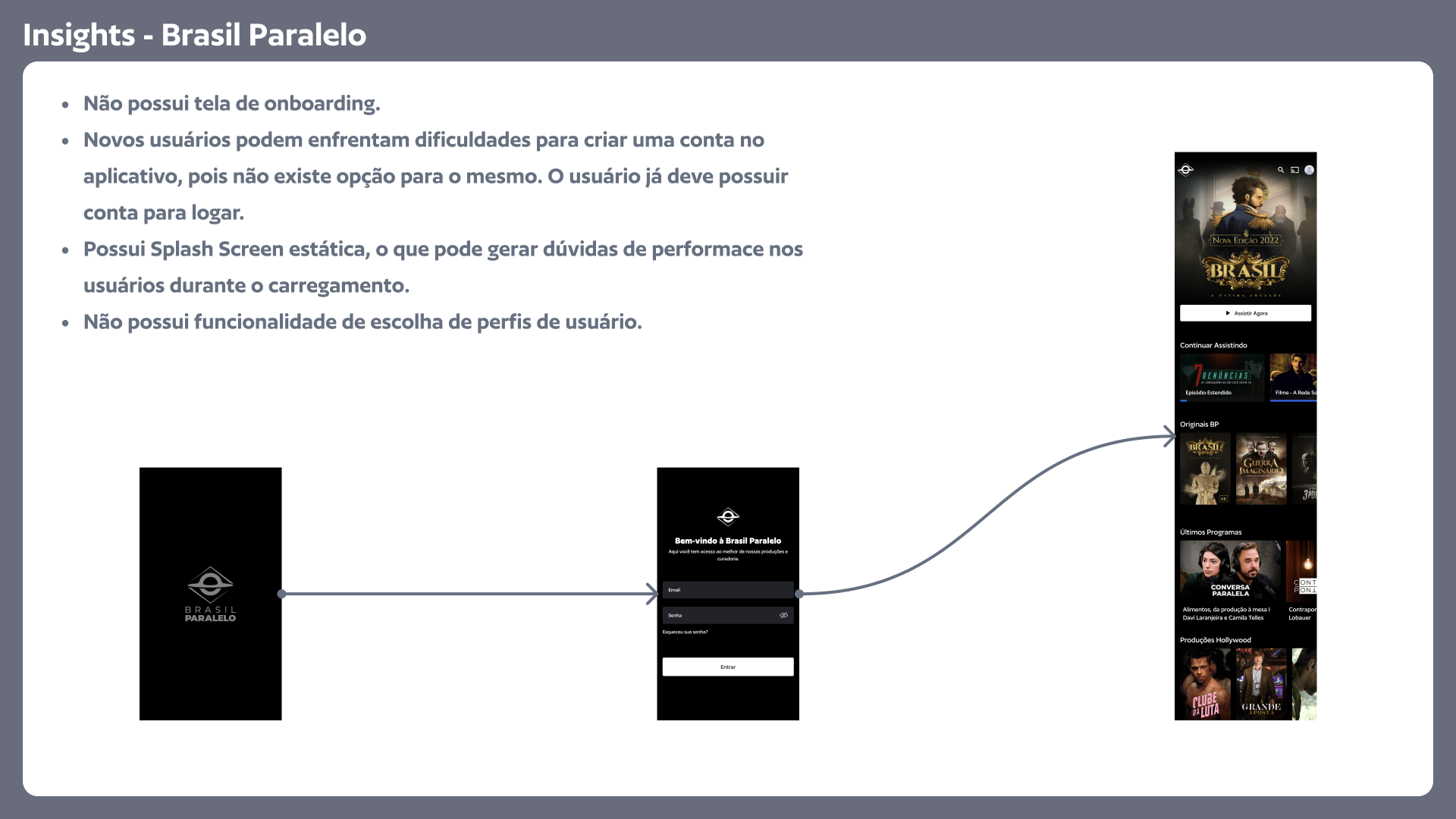
Brasil Paralelo
- Does not have an onboarding screen.
- New users may face difficulties creating an account within the application as there is no option available for it. Users must already have an account to log in.
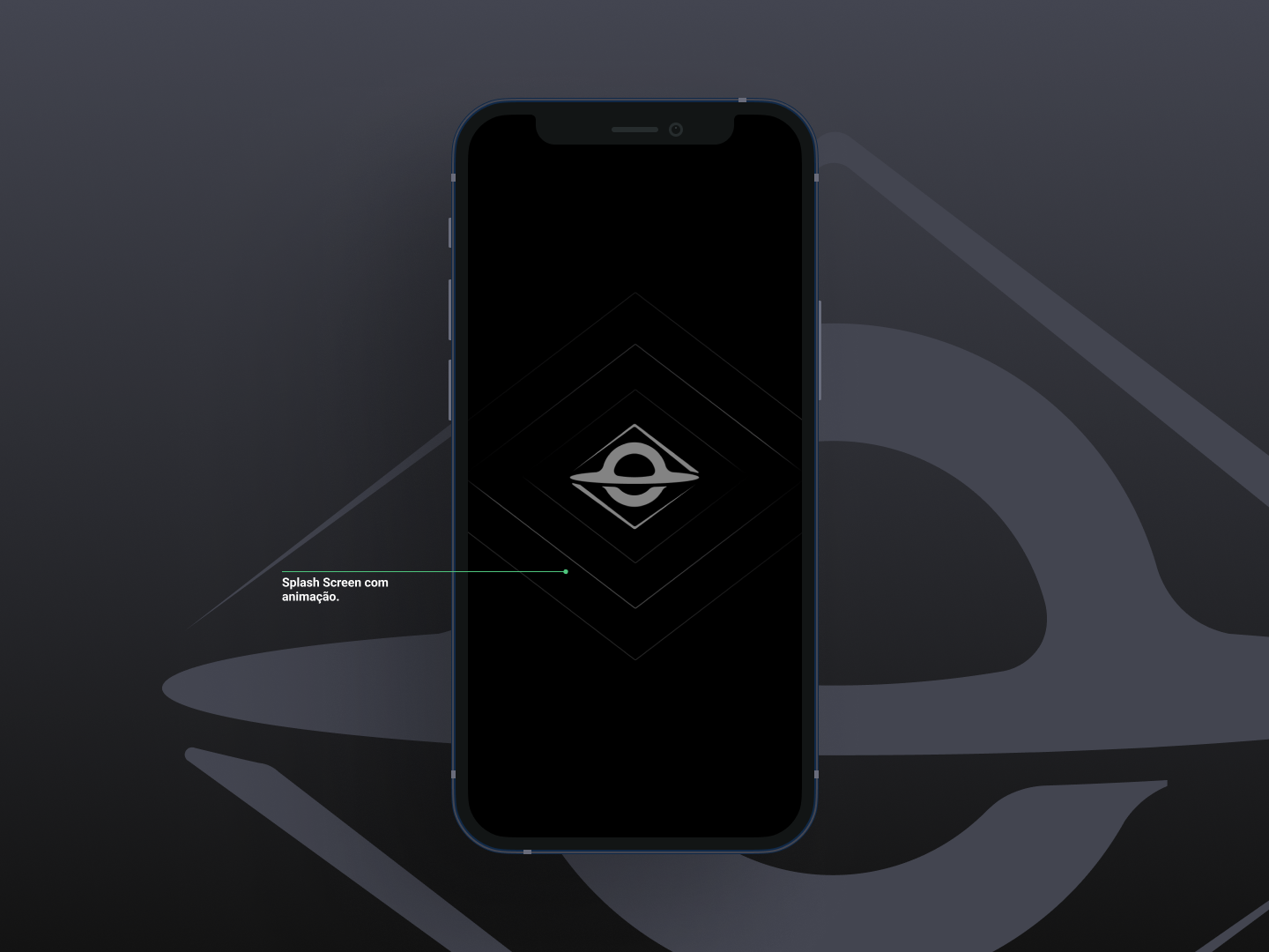
- Has a static splash screen, which may raise performance concerns for users during loading.
- Does not have a user profile selection functionality.
4 – App Redesign
4.1 – Crazy 8’s Exercises for Idea Generation
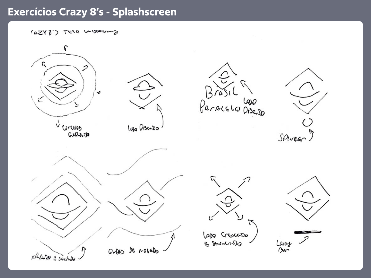
To kickstart the redesign of the screens, I decided to begin with some quick idea-generation exercises using the technique known as “Crazy 8’s.” In this approach, participants are challenged to create eight different concepts within a short period of time. This activity is particularly useful for stimulating creativity, exploring diverse approaches, and generating multiple interface ideas in a short amount of time.
The first step of this process involved rapidly generating various ideas for the initial animation screen (Splashscreen). For this purpose, I created eight distinct versions of this screen. These ideas were based on visual elements related to the brand Brasil Paralelo, such as the logo and representative colors. The main objective was to provide feedback to the user, indicating that the app was loading and not frozen. For this reason, the use of animations played an important role in this context.
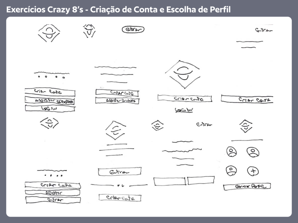
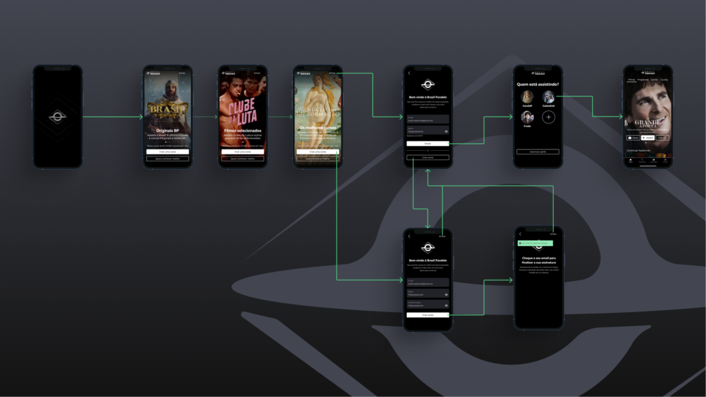
Next, I focused on the Onboarding screens and user profile selection. I once again performed “Crazy 8’s” exercises to generate quick ideas and explore different concepts for these screens. In the case of the Onboarding screens, my goal was for them to cater to both new users, showcasing some of the value offered by the streaming service even before creating an account, and existing users, allowing them to log in quickly and easily. As for the profile selection screen, the objective was to make it simple and intuitive, enabling users to create and access profiles, as well as providing an option to manage them (where they could be deleted or configured as adult or child profiles).
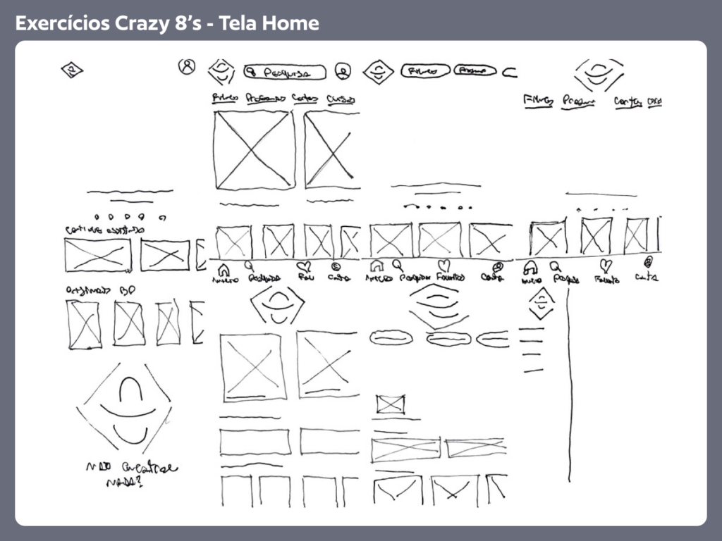
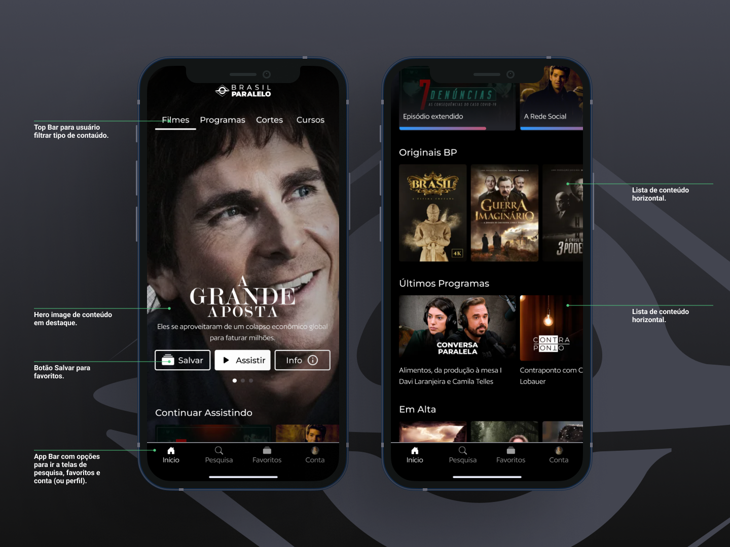
In the third stage of the project, the focus was on the app’s home screen, which is the first screen displayed to users after profile selection. Once again, we used Crazy 8’s technique to generate quick ideas and explore various layouts and visual elements for this screen. Some interesting ideas emerged, such as the inclusion of a top bar for users to select different types of content, a navigation bar to organize the app between the home screen, a favorites screen (where users can download content for later viewing), a dedicated screen for profile information, and another screen dedicated to searching the streaming service’s content library.
4.2 – New Screens and User Flow
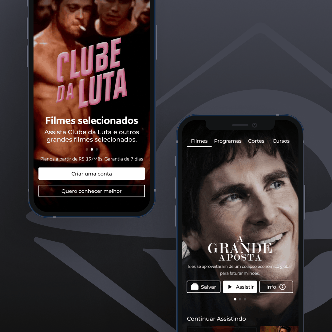
In the Splashscreen screen, an animation of the Brasil Paralelo logo was added to provide visual feedback to the user, indicating that the app is in the loading process, preventing them from thinking that the app is frozen. This animation creates a more pleasant experience and informs the user that the application is being initiated.
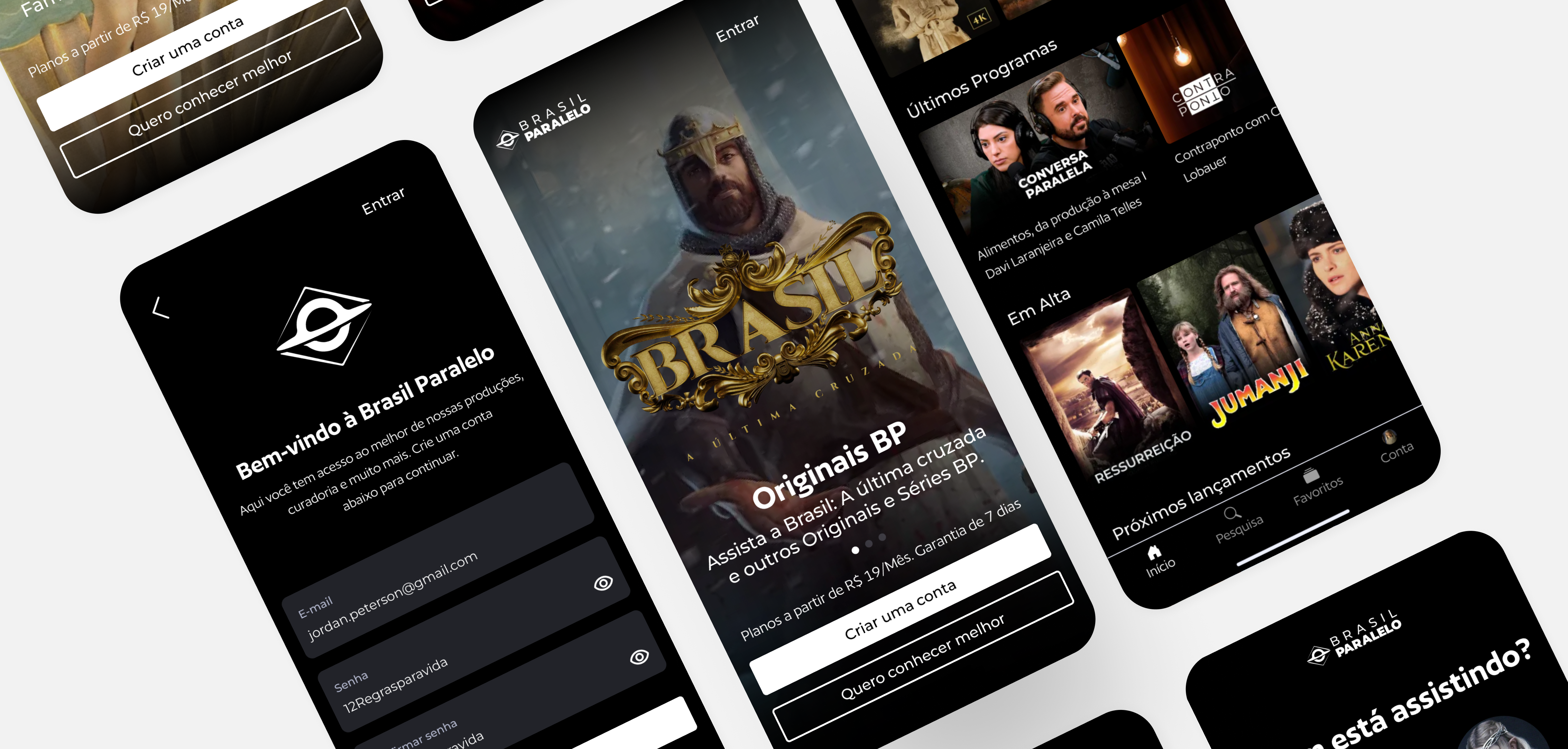
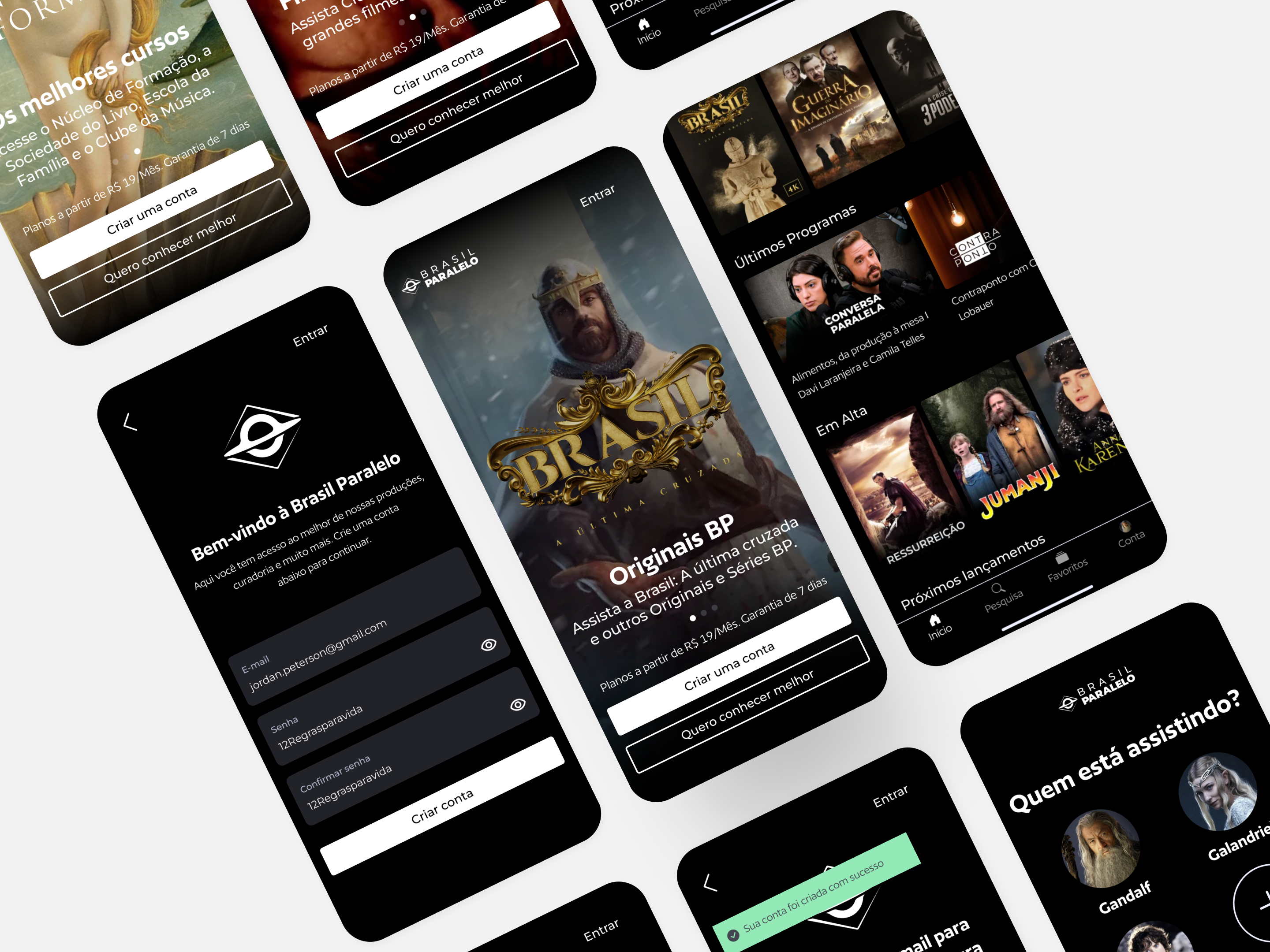
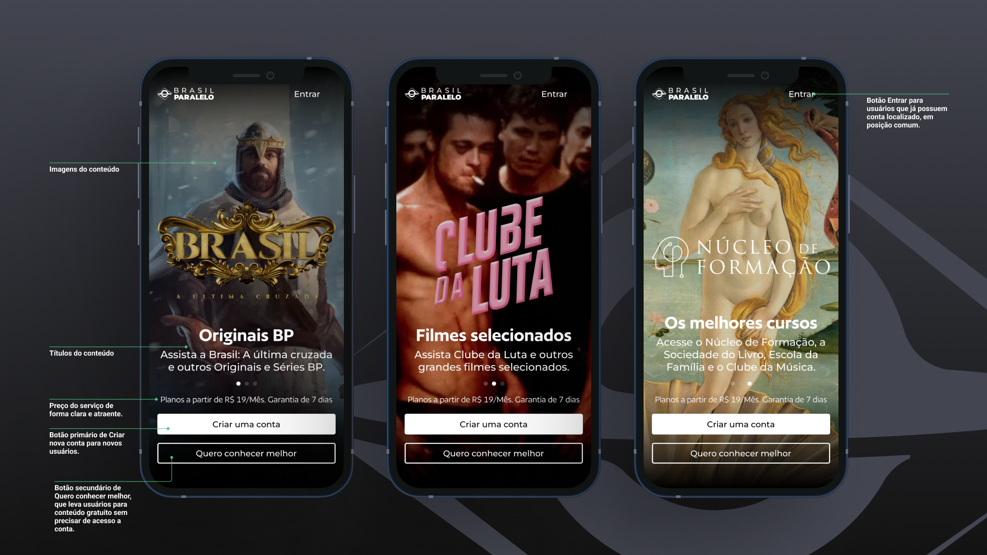
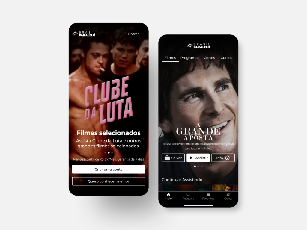
In the Onboarding process, significant improvements have been implemented. Buttons for “Create an account” have been added to facilitate new users’ access to the app. Additionally, a “Learn more” button has been included, redirecting users to open content that can be accessed without an account, allowing them to experience some of the value of the streaming service before deciding to create an account. Prominent images of series and explanatory texts about the content offered by Brasil Paralelo have been inserted, along with the subscription price of the service, helping the user understand the platform’s value proposition. Furthermore, the “Sign In” button has been positioned in the top right corner, following the convention used by other streaming services.
A profile selection screen was created to allow multiple users to use the platform with the same account, following the common behavior adopted by most competitors. On this screen, avatars were added for each registered profile, making it easy to identify each user. A button to add new profiles was also included, along with a button to manage profiles, allowing the user to create, modify, and remove profiles and adjust their settings.
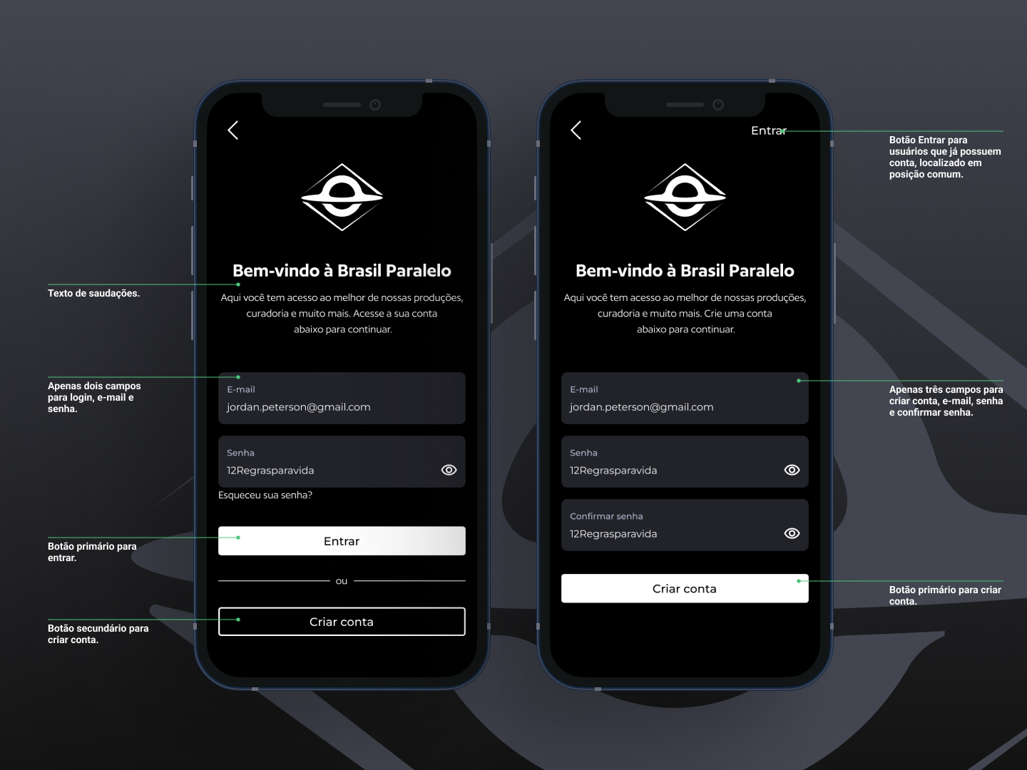
In the account creation screen, we made an important improvement by allowing new users to create their accounts directly through the mobile application, eliminating the need to access the website for this process. Standard fields such as Email, Password, and password confirmation have been added to ensure secure registration. In addition to the main “Create Account” button, we also included a “Sign In” button in case the user already has an account, making the transition to the next step easier.
As for the login screen, it underwent a few changes and remains similar to the previous version. However, we added a secondary “Create Account” button in case a new user accidentally arrives at this screen. This addition aims to provide a smoother experience, allowing users to create an account immediately if needed, avoiding the need to go back to the previous screen.
The main screen of the application underwent significant changes to improve the user experience. Firstly, we added an App Bar at the top, allowing users to choose between different types of available content (movies, series, etc.). This addition provides more intuitive and quick navigation, directing users to their specific interests. Additionally, we created a Nav Bar at the bottom of the application, offering the possibility to easily navigate between different screens, such as Home, Search, Favorites, and Account. This navigation improvement helps users quickly access key features of the application.
Another notable change was the inclusion of large cards with featured content images at the beginning of the screen, which I’ll refer to as Hero Cards, allowing a visually appealing presentation of the content. Additionally, each Hero Card now has a dedicated button to save the content as a favorite, providing users with an easy way to access and revisit their favorite content.
These improvements in the redesign of the Brasil Paralelo mobile application screens were implemented with the goal of enhancing usability, simplifying the account creation process, facilitating navigation between screens, and highlighting relevant content. The result is a more intuitive and enjoyable user experience, allowing users to discover and access the streaming service’s content with greater ease and satisfaction.
5 – Implementation
Before implementing the proposed changes and solutions in this project, it is essential to conduct extensive prototype testing with users. I recommend conducting four rounds of five usability tests with personas, with adjustments made to the prototype at the end of each round. After these steps and ensuring that the prototype is suitable, the screens should be developed by the engineering team. It is important to follow a phased implementation approach, building the screens or functionalities incrementally, always with a portion of users through A/B testing. Throughout this process, it is crucial to measure the most important metrics to determine if the changes are truly improving the user experience and achieving the strategic business objectives (KPIs).
6 – Conclusion
This project highlighted the potential to enhance the user experience and achieve business objectives through the redesign of key screens in the application and the implementation of simple functionalities. The proposed approach, based on agile user research and the study of competitor applications, enabled a rapid improvement in the user experience of the Brasil Paralelo streaming application. This project reinforces the effectiveness of a lean product design process, user-focused, and data-driven, allowing for the rapid delivery of improvements in the user experience.